

Website & content
The Site Management area in the dashboard bundles everything about your public website: Pages · Events · News · Blogs · Media.
Pages (widget editor)
Section titled “Pages (widget editor)”Under Pages you manage your organization’s web pages. Every page is built from freely placeable widgets (heading, text, hero, image, gallery, FAQ, form, event/news list and more).
Create a page
Section titled “Create a page”- New page → title (the slug is suggested automatically).
- Optionally pick a starter template (landing, content, contact, FAQ) — it fills the page with matching widgets that you then adapt freely.
Working in the editor
Section titled “Working in the editor”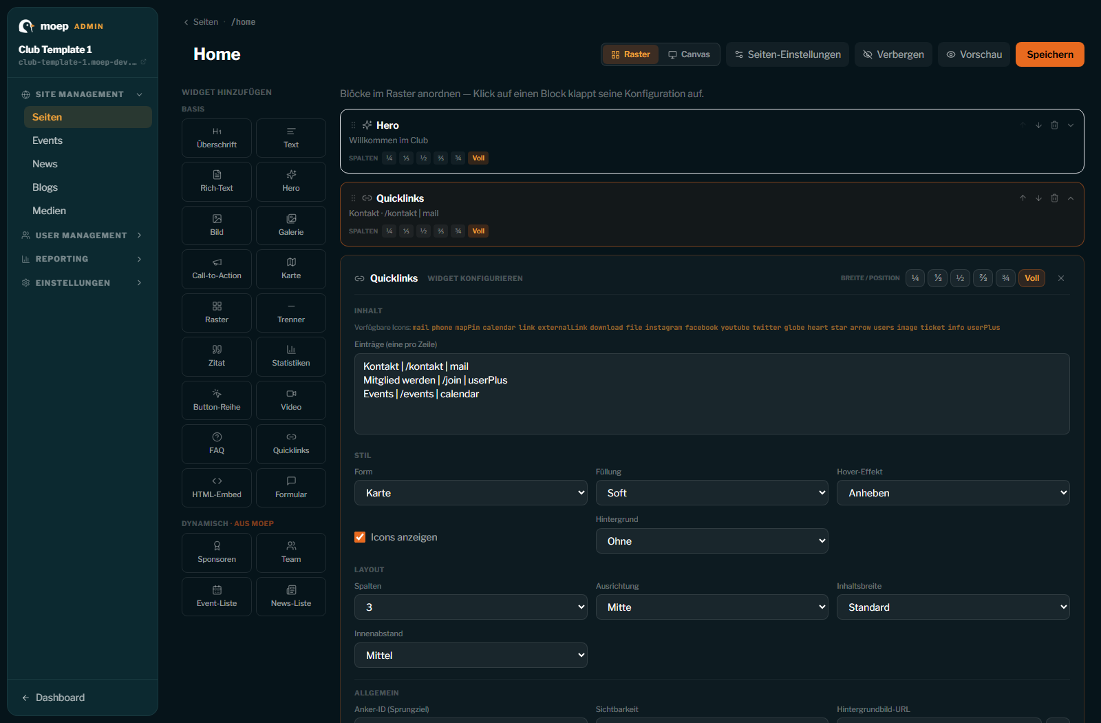
- Add widgets: click them in the palette on the left (groups Basic and Dynamic — from moep).
- Configure: clicking a block expands its configuration right below its row — with width presets (¼ to full) and the groups Content, Style, Layout and General (anchor, visibility, time window, background image). Click again to collapse. Options that currently have no effect are hidden — a button’s target, for example, only appears once the button has a label.
- Editing lists: widgets with multiple entries (gallery, sponsors, FAQ, stats, buttons, quick links, feature cards) have a row editor: add, move and delete entries — each column with the right input, including picking images from the media library and choosing icons.
- Arrange: move blocks by drag and drop (or with ↑/↓). The width per block determines how they fit into the rows of the 12-column grid; dropping a block on the area at the bottom moves it to the end of the page.
- Duplicate & reuse: a block can be duplicated or copied to the clipboard and pasted on another page. Insert section appends a complete template section.
- Design variants: heading, text, quote, stats, feature cards and gallery have a variant under Style (e.g. plain / card / bordered / numbered) — always in your theme’s colors.
- Hide and schedule: under General you can hide a block or set a time window (show from / until). This only controls display and is not access protection — use page visibility for non-public content.
- Grid / Canvas: the toggle at the top switches between the structural view (grid) and a visual preview (canvas). The preview renders the page in your theme colors and can be switched between desktop and mobile; hidden blocks are marked. Team, event and news lists appear as placeholders because their content is only loaded when the page is served.
- Unsaved changes: the editor only saves on click. While changes are pending the header shows Unsaved and a warning prevents accidentally closing the tab.
- Translations: If your organization has enabled additional languages (Settings → Languages), the widget configuration shows language tabs: text fields can be translated per language, empty fields show the main language. Visitors switch languages via the switcher at the top of the page.
- Page settings: slug, homepage flag, navigation, visibility (public / members / specific role — enforced server-side) and SEO (meta title, description, OG image, noindex).
- Save stores your work, Publish puts the page live; Preview opens the public URL.
New & updated
Section titled “New & updated”- Hero: optional kicker/badge (small accent pill) above the title.
- Map: now renders a real embedded map — enter an address (e.g. “Musterstrasse 1, 6000 Luzern”) or paste a Google Maps link.
- Calendar / schedule: new dynamic widget that shows your events as an agenda grouped by day or month (range/count configurable) — complementing the event list.
- Quick links: more compact tiles, two columns on mobile.
News & blogs (article editor)
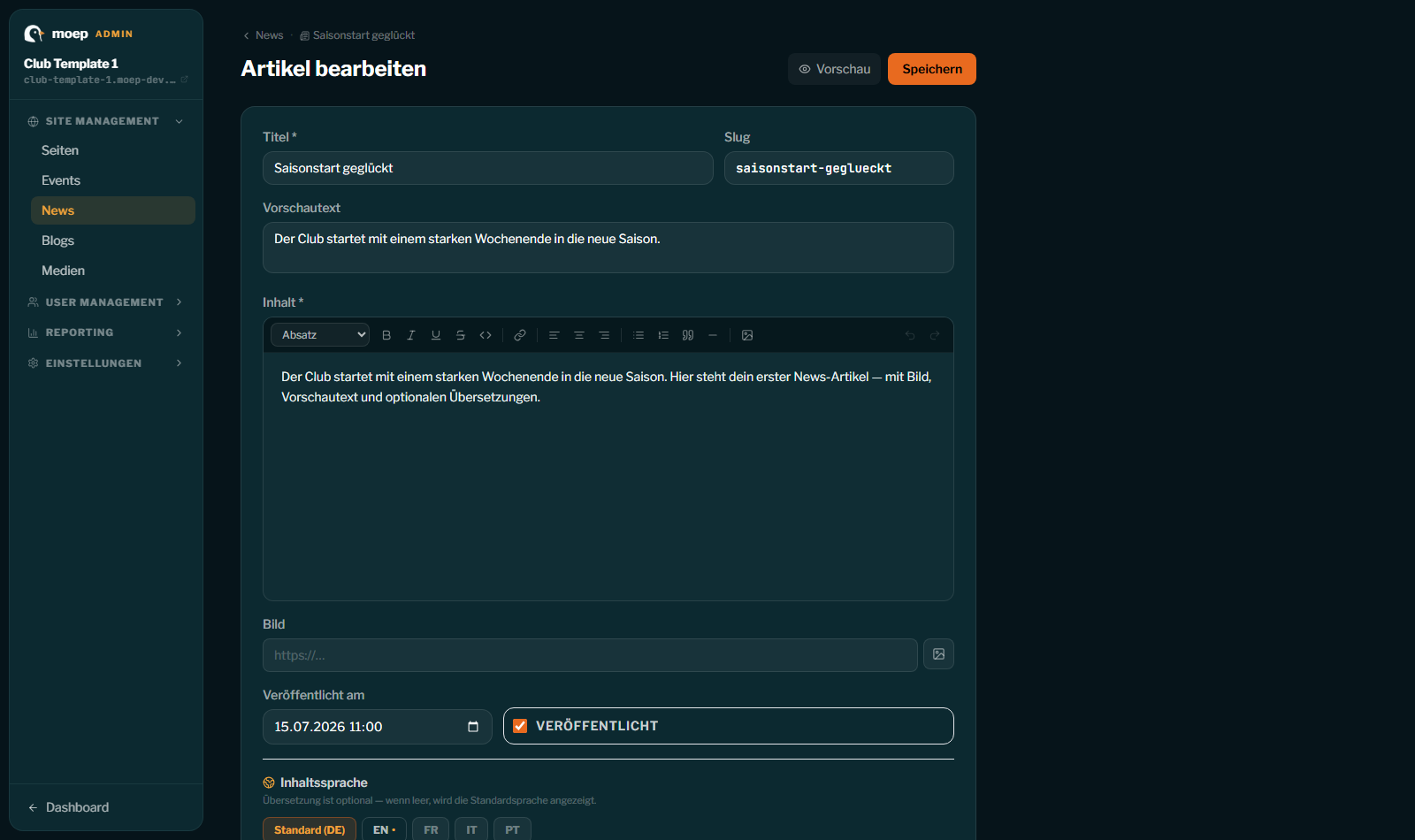
Section titled “News & blogs (article editor)”News and Blogs have their own menu items and share one article editor:
| Field | Effect |
|---|---|
| Title / Slug | Headline and URL of the article (blogs live under /blog/…). |
| Preview text | Teaser in lists and meta description for search engines. |
| Content | Rich text with headings, lists, links and images. |
| Image | Header image (from the media library or via upload). |
| Published on | Display date; controls sorting in lists. |
| Published | The article only goes public once this is checked. |
Content language: use the language tabs (EN/FR/IT/PT) to add optional translations for title, preview text and content. Empty fields automatically fall back to the default language; public articles show language chips when translations exist.
Events
Section titled “Events”Under Events you manage happenings with their own detail page on your website:
- New event / Edit opens the event page with all fields: title, category, visibility, start/end, location, short description, detailed info (rich text) and header image. Feature event shows a button in the public navigation.
- Visibility (like pages): public (everyone), members (logged-in members only), private (never public) or a specific role (only holders of that role). This is access protection, enforced server-side — a non-public event is served only to authorized people, even on a direct request.
- Participants: registrations with capacity, participant list incl. CSV export, QR tickets for attendees and check-in (scan station or one click in the list).
- Publish puts the event live; tournament events continue to be managed in the tournament app.
Floor plans (Pro)
Section titled “Floor plans (Pro)”Under Floor plans you draw an interactive map of your grounds (clubhouse, hall, tournament site) with buildings, areas, markers and streets — including a real 3D preview. A plan is embedded via a page’s floor plan widget (by slug) or linked directly to an event. In the floor plan editor you can also assign one of your partners (Engagement → Partners) to an area or a marker — it then appears with its logo on the roof and opens its own detail page for visitors. Details, tools and every setting live in the dedicated guide → Floor plans.
Directory widget
Section titled “Directory widget”For an overview page of your partners, the page editor offers a Directory widget — grid or list, with or without logos. As the source, choose either all published partners of the organization that appear in the public sponsor wall or only those placed on a particular floor plan — the latter also lists partners that are on the plan but do not appear in the public sponsor wall (the same map the floor plan itself uses, not a second, filtered list). A published partner that is deliberately kept out of the sponsor wall (the “Show in the public sponsor wall” toggle turned off) therefore does not show up under the “Organization” source — only under the plan source. You can additionally filter by partner type (main sponsor, sponsor, media partner, partner).
Team & rider profiles
Section titled “Team & rider profiles”The team widget shows your members as a grid or list. Every team member has a public
profile page (/team/…) with photo, role, bio and social links — plus a generic
profile: location, sponsors and a free-form facts list (e.g. “Stance | Regular”,
“Homespot | …”, “Signature move | …”). Maintained in the team editor; the details render
org-neutrally in your theme colors.
AI assistant (Pro)
Section titled “AI assistant (Pro)”In the article (News/Blogs) and event editors an AI assistant helps you write: draft from bullet points, improve existing text and translate content into other languages (Pro). See the dedicated guide → AI assistant.
The media library collects your organization’s images and files (uploads up to 10 MB). All image fields (page widgets, articles, events) can pick from it via “From library”.
Design & branding
Section titled “Design & branding”Under Settings → Design you define your website’s appearance:
- Colors: primary, text, background, surface and navigation colors — all widgets use these theme colors.
- Logo & size and favicon: upload your own favicon (PNG/ICO/SVG) — it replaces the platform icon in your org site’s browser tab.
- Fonts: heading and body from a curated list or upload your own font (woff2/woff/ttf/otf, org-scoped).
- Design style: Modern (rounded corners, soft shadows), Classic (subtle) or Minimal (sharp edges, no shadows) — controls the site’s corner radius and shadows globally.
- Content width: full · wide · centered (narrow blog column).
Transparent header over the hero: if a page starts with a hero image, the header sits transparently on top of it and turns solid on scroll. Without a hero image the header stays in the background color throughout.
Navigation & SEO
Section titled “Navigation & SEO”- Settings → Navigation: order and visibility of your website’s menu items.
- Settings → SEO & GEO: meta description, keywords, OG image, location (local SEO), contact & social profiles — including automatic sitemap and structured data.